The challenge
Local bluegrass events are often spread across venue websites, social media pages, and community event listings. This makes it difficult for users to discover nearby performances and keep track of ticket information.
“How might a single mobile experience help fans discover local shows and buy tickets without bouncing between venue sites, social media, and word of mouth?”Design question
Research
To better understand the space, I attended local bluegrass performances and reviewed existing event and ticketing platforms.
Competitive landscape
I compared several platforms commonly used to discover and purchase tickets for live music events.
| Platform | What works well | Frustration observed |
|---|---|---|
| Ticketmaster | Established purchasing experience and secure checkout | Focused primarily on larger events, making smaller local performances harder to discover |
| Venue websites | Detailed information about individual venues and events | Users must already know which venue to visit before discovering an event |
| Facebook and Instagram | Helpful for discovering local events through community posts and promotions | Event information is often incomplete, scattered, or difficult to track |
| Community event listings | Surface local events that may not appear on major ticketing platforms | Information varies by source and often lacks integrated ticket purchasing |
What I took away: Across every platform, the same pattern appeared. Discovery and purchasing live in separate places, and smaller local shows fall through the cracks. This project combines regional discovery, simple checkout, and ticket access in one experience.
Low fidelity wireframes
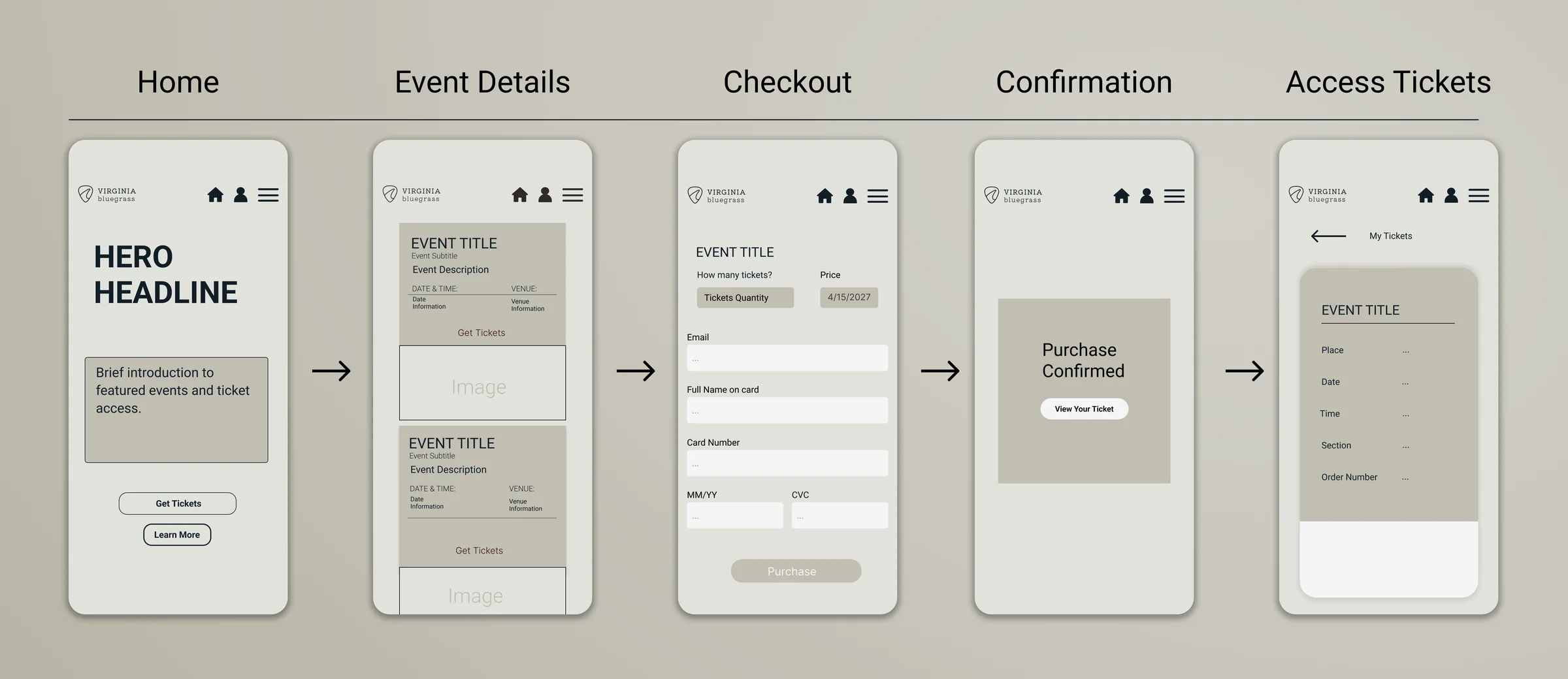
Low fidelity wireframes were used to establish page structure, content hierarchy, and the purchasing flow before moving into visual design.
 View larger
Design system
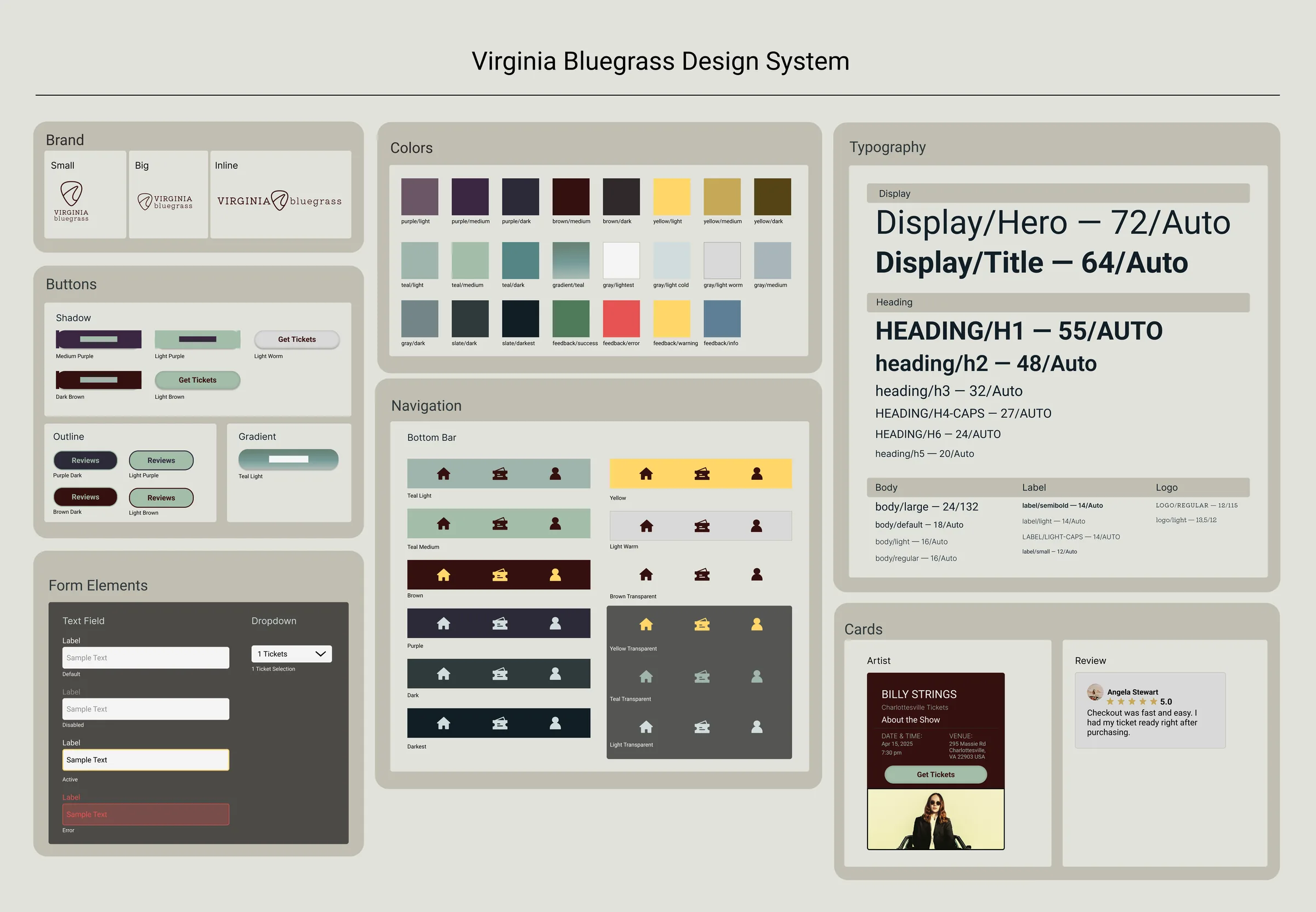
Before building the high fidelity screens, I created a design system in Figma to keep the design consistent. I defined the colors and typography as reusable styles and built a component library for things like buttons, navigation, form fields, and cards. This made it easier to keep the screens consistent as I continued developing the app.
 View larger
High fidelity designs
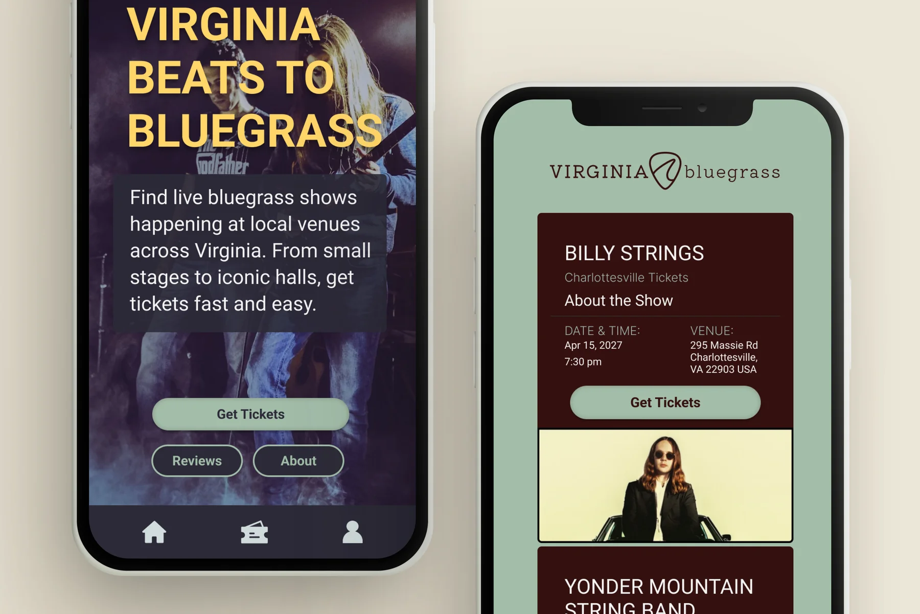
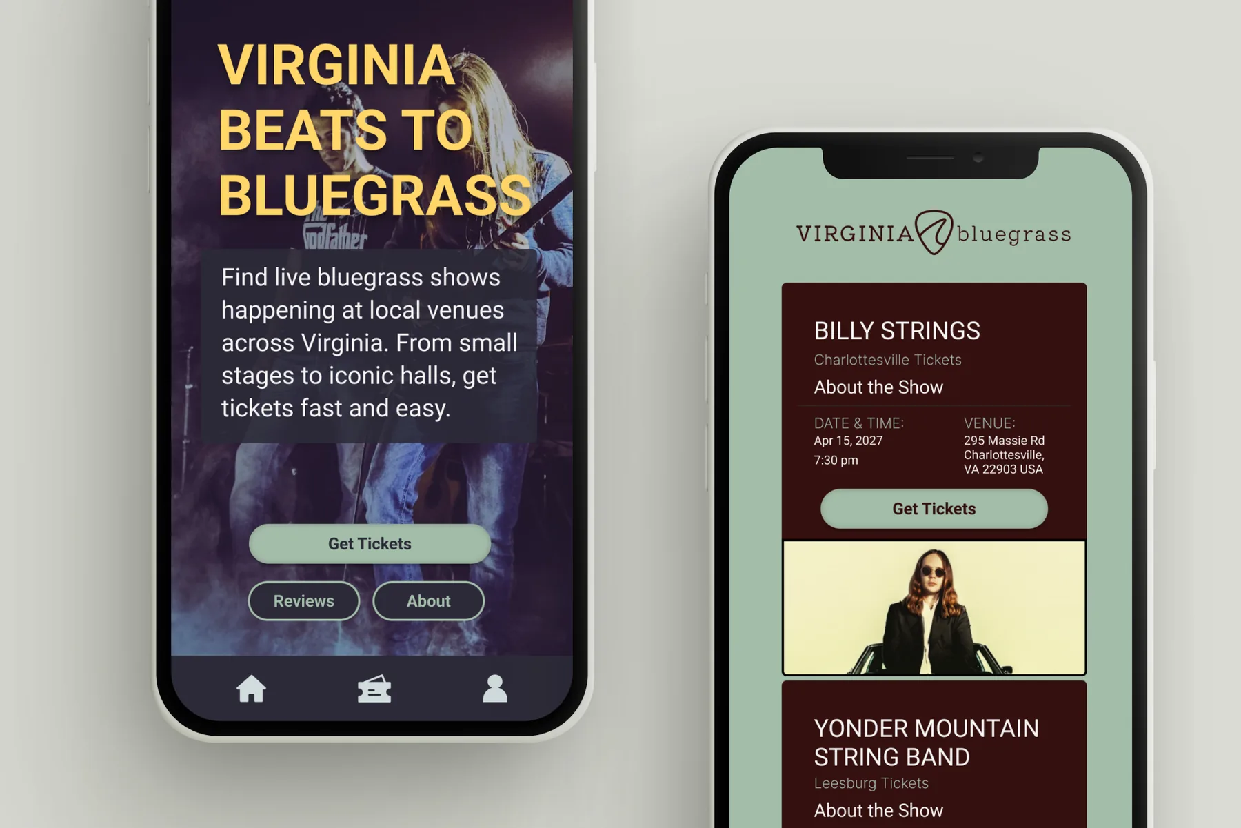
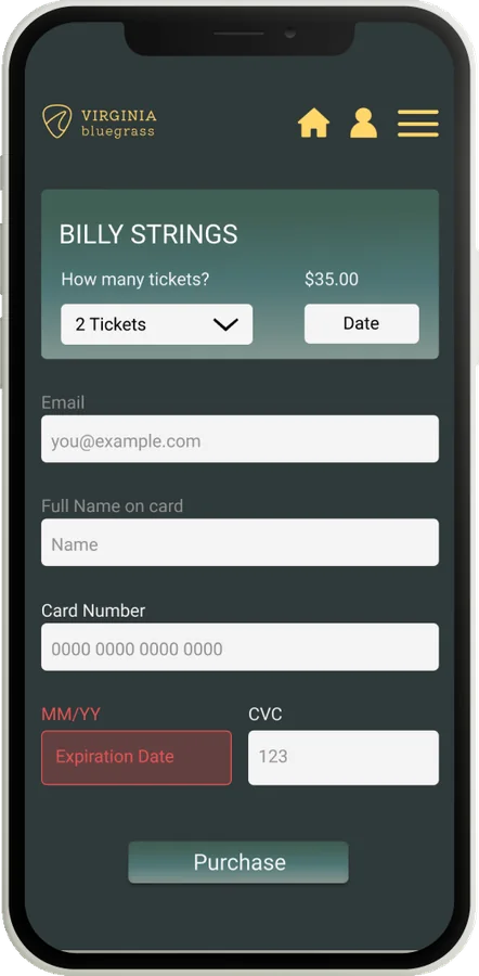
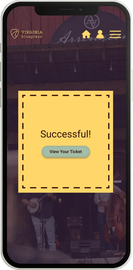
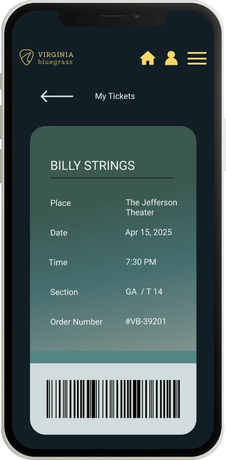
The high fidelity screens establish the brand and surface the fastest path to tickets, from the homepage to event details.
 View larger
User flow
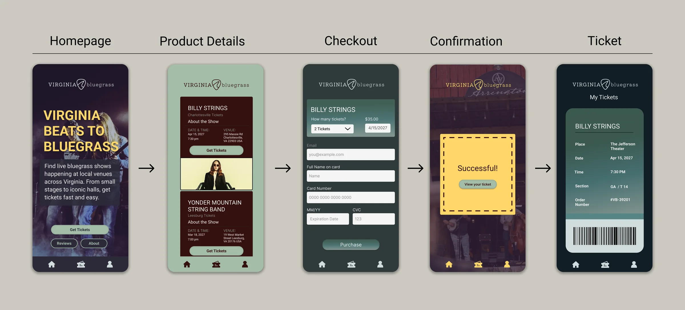
This flow illustrates the core ticket purchasing experience, guiding users from event discovery to ticket access.
 View larger
 View larger
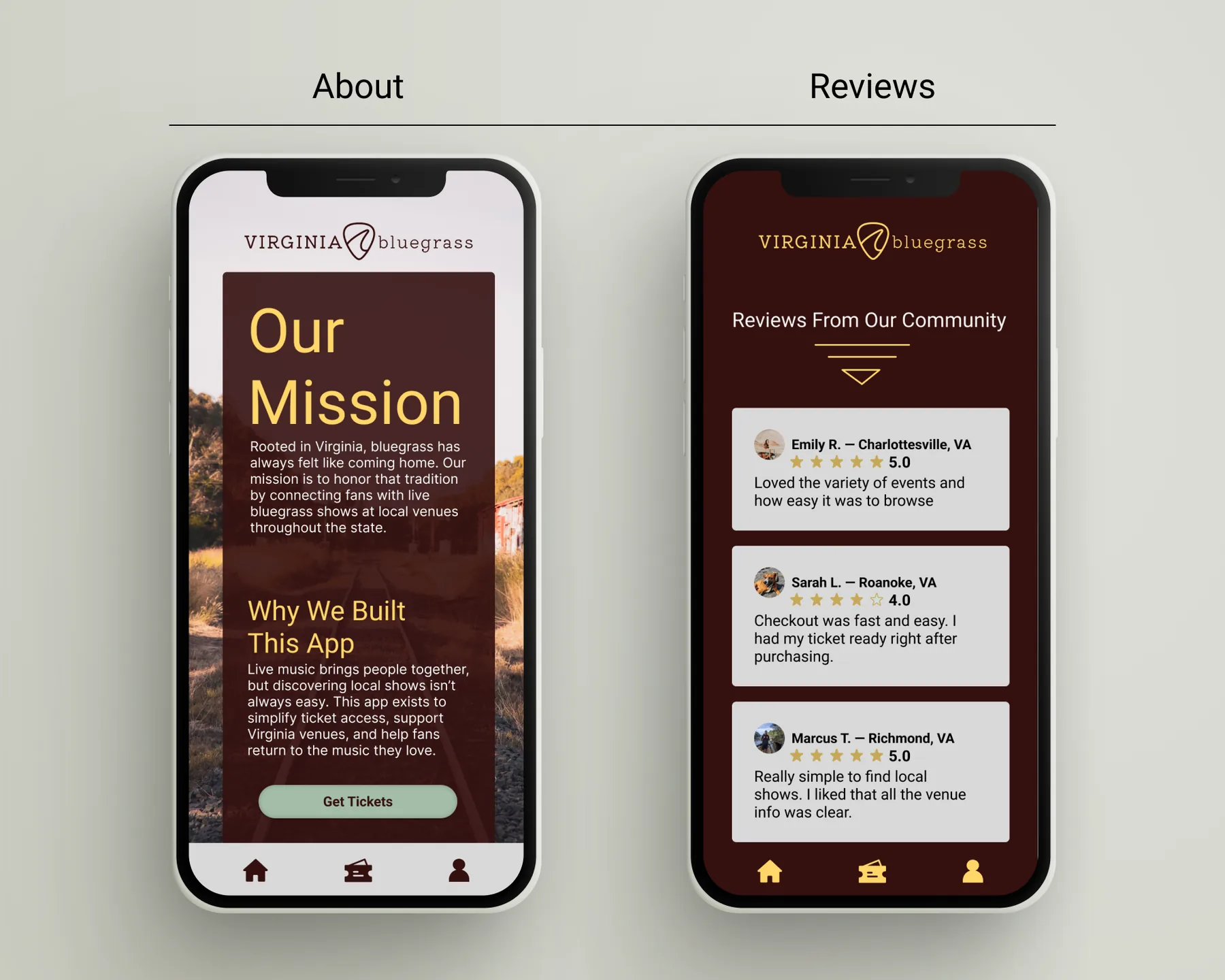
Supporting pages
About
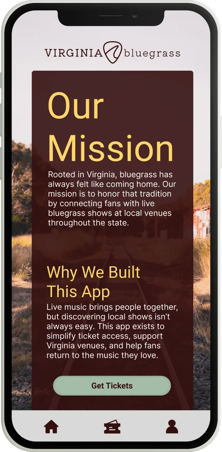
The About page reinforces the platform’s mission and connection to Virginia’s bluegrass community through storytelling and brand-focused content.
Reviews
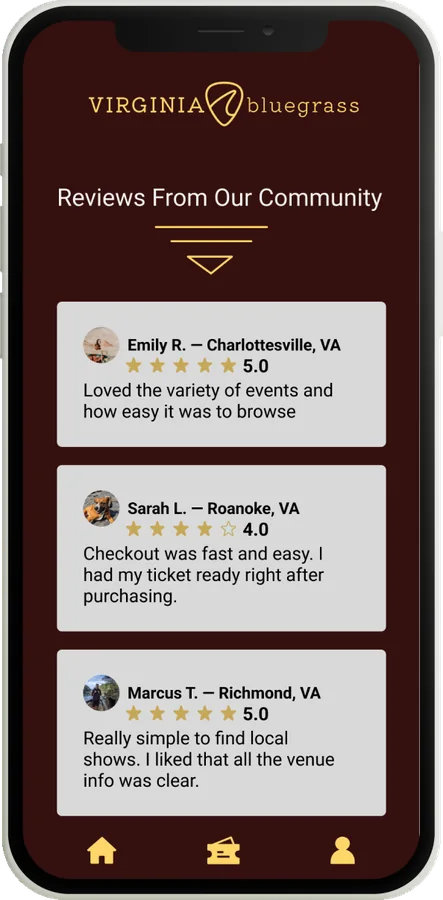
The Reviews page uses customer testimonials and ratings to build trust and support purchasing decisions.
 View larger
Design decisions
Visual identity
Live bluegrass photography and warm colors set the mood, but they hurt text legibility on a phone. I placed solid color blocks behind key information to keep the atmosphere without sacrificing readability.
Content hierarchy
Research showed users visited multiple sources just to compare events. Each event card prioritizes the artist, date, venue, and ticket access so users can compare shows at a glance.
Purchase experience
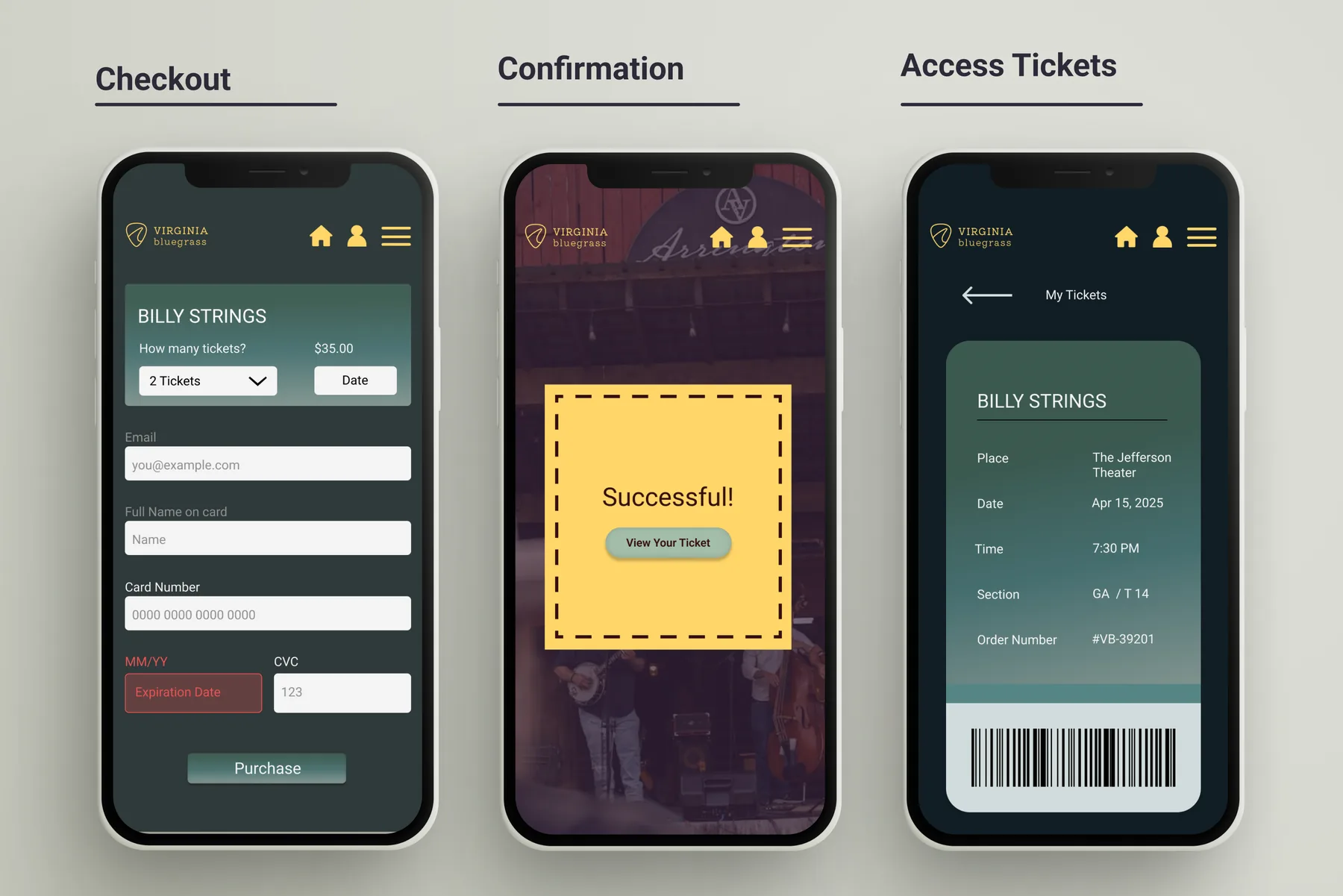
Many ticketing platforms pad checkout with extra steps and promotions. I simplified the flow to ticket quantity, contact information, and payment details on a single screen.
Outcomes
This project produced a complete ticket purchasing experience, from event discovery to digital ticket access. As a concept project, it was not tested with users. These are the areas I would explore next.
What I’d explore next
- Whether users can find a local show and reach checkout without bouncing between screens.
- Whether the single-screen checkout actually reduces drop-off versus a multi-step flow.
- Whether leading event cards with artist, date, and venue helps users decide faster.
Key learnings
- Balancing event discovery and ticket purchasing without overcrowding the interface.
- Maintaining a consistent visual identity across browsing, checkout, and ticket access screens.
- Simplifying payment forms for smaller mobile screens.