The challenge
Stenberg CPA’s existing website did not clearly communicate the firm’s full range of services or the value of an ongoing accounting relationship. The redesign needed to improve clarity, establish a stronger visual identity, and help prospective clients understand how Stenberg supports their business throughout the year.
“How might a clearer website experience help Stenberg CPA attract ongoing business clients while making its services, people, and process easier to understand?”Design question
Existing website
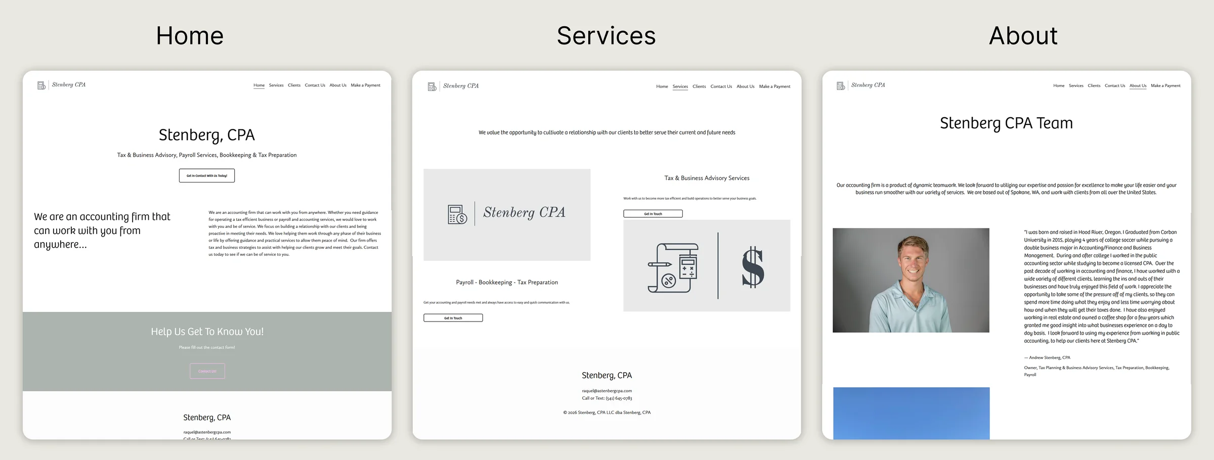
The existing website provided the foundation for the redesign. Reviewing its content, structure, and visual presentation helped identify opportunities to improve hierarchy, messaging, and the overall client experience.
 View larger
Research
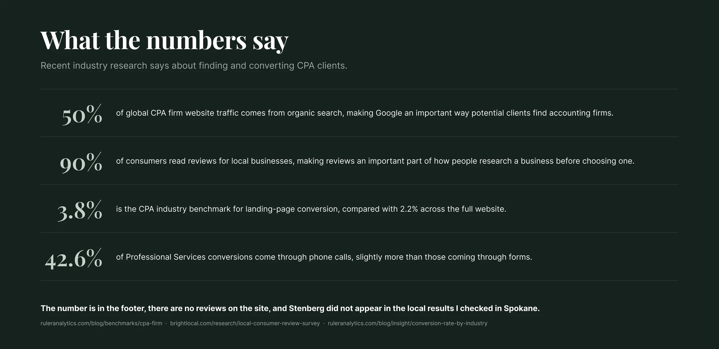
To better understand the firm’s goals and identify opportunities for improvement, I reviewed the existing website, analyzed the client’s business objectives, and explored the needs of ongoing business clients. The research focused on how Stenberg could communicate its services more clearly, establish trust, and create a more accessible experience for clients working virtually.
 View larger
Strategic direction
The redesign was guided by three priorities.
- Clearer positioning to attract ongoing business clients rather than primarily one time tax customers.
- Connected services to present tax, bookkeeping, payroll, and advisory as parts of one accounting relationship.
- Accessible experience to make the firm’s virtual process, communication, and next steps easier to understand.
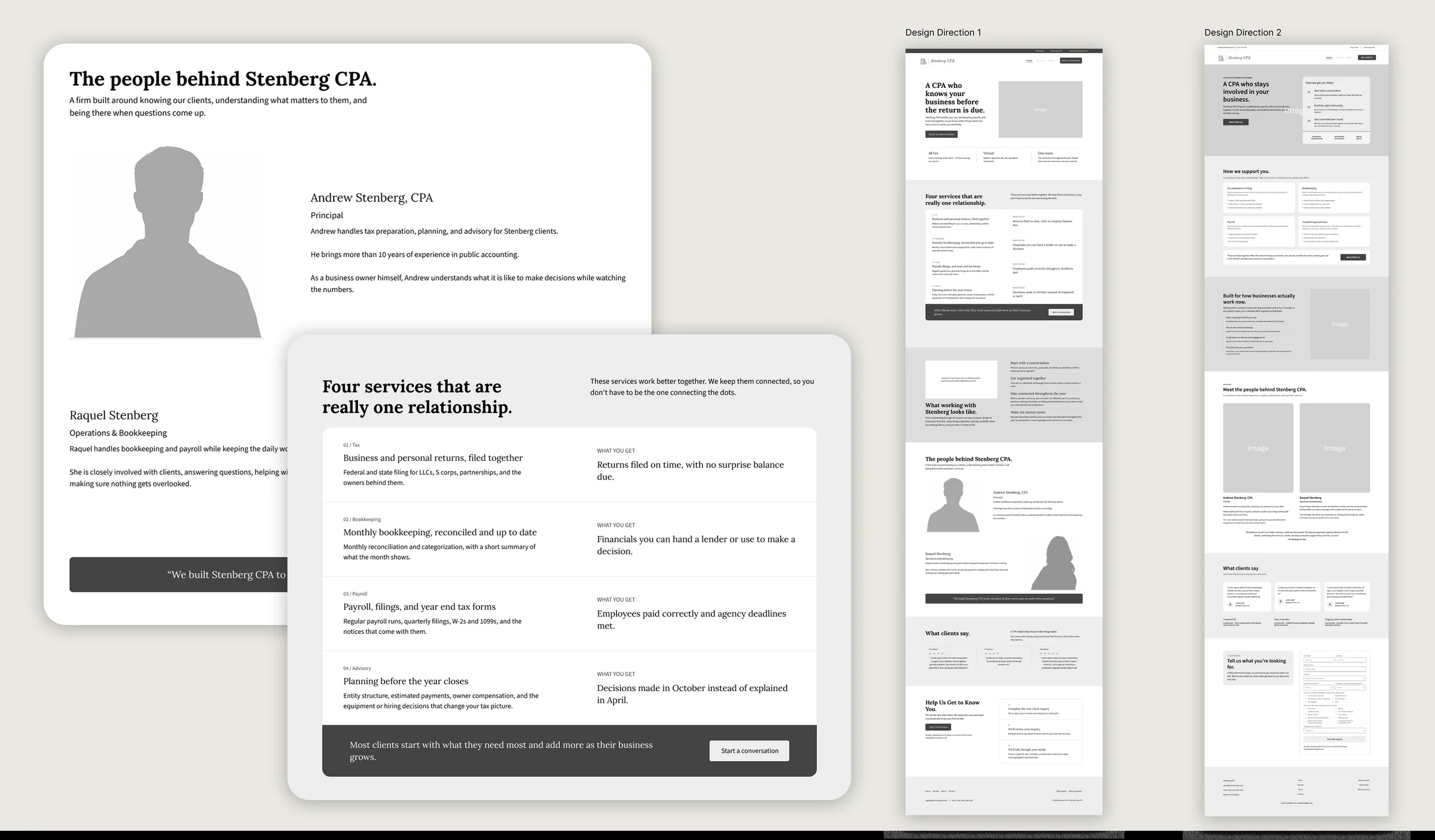
Low fidelity wireframes
Early wireframes were used to establish the website’s structure, content hierarchy, and conversion paths before moving into visual design. The layouts explored how Stenberg could communicate its services, introduce the people behind the firm, explain the client experience, and guide prospective clients toward making contact.
 View larger
Brand identity
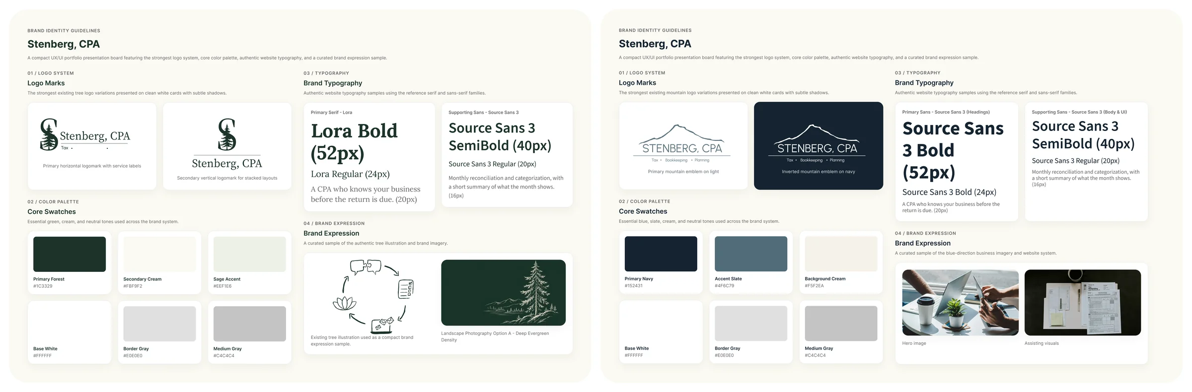
I explored two visual directions for Stenberg CPA, one centered on personal relationship, one centered on modern, structured support, so the client could choose by reacting to something concrete rather than a brief.
 View larger
Relationship First
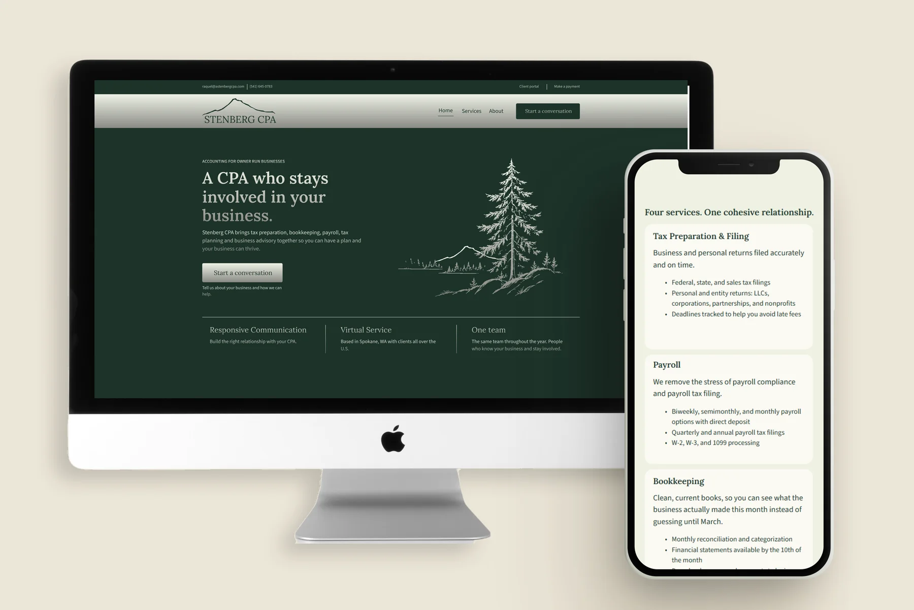
Inspired by the Pacific Northwest, using deep forest greens, muted sage, and cream tones, paired with traditional serif type and hand drawn imagery of fir trees and the surrounding landscape, for a brand that feels personal while still professional.
Modern Business Support
Inspired by Mount Hood, where the company was built, centering the mountain as its visual anchor, paired with a deep blue palette, clean structured layouts, and bold sans-serif type for a modern, confident feel.
The client was drawn to the Mount Hood logo from Modern Business Support but preferred the hand drawn illustrations and green palette from Relationship First, so these were combined into one identity rather than choosing a single direction outright.
High fidelity designs
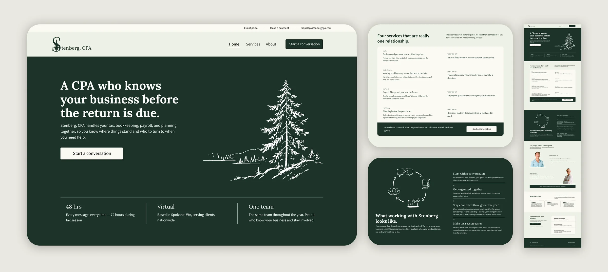
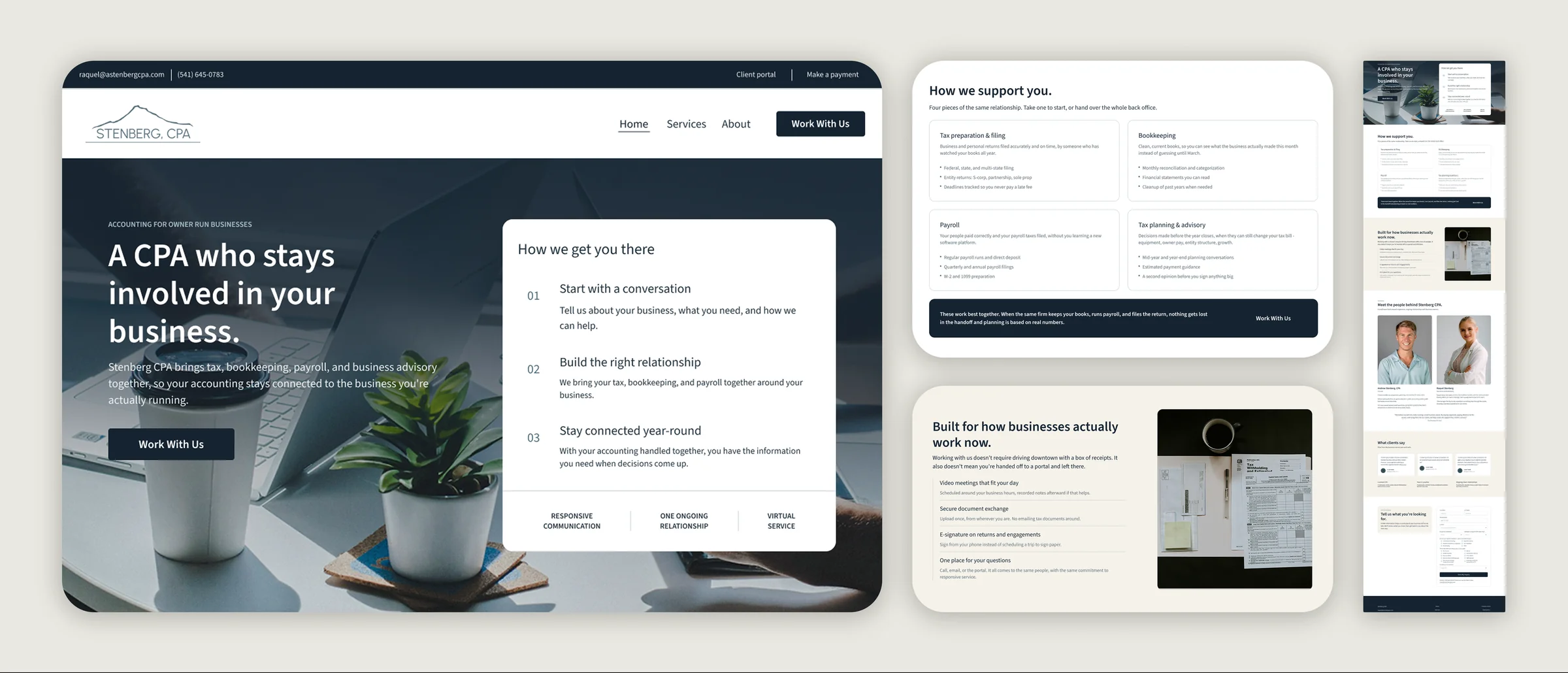
The high fidelity designs brought both directions to life as complete website concepts, presented to the client for feedback before narrowing to one.
Relationship First
The green direction emphasized the personal relationship between Stenberg and its clients, with messaging focused on staying involved and supporting clients beyond tax season.
 View larger
Modern Business Support
The blue direction emphasized the modern, connected way Stenberg delivers accounting support, with messaging focused on convenience and a virtual experience built around how businesses work today.
 View larger
Final design
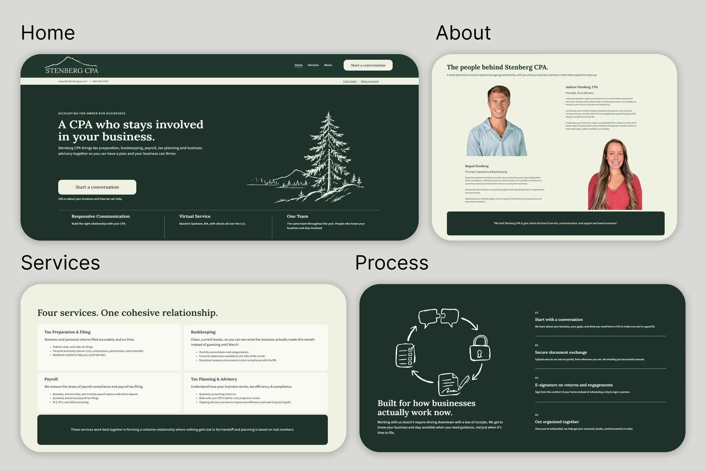
The final site carries Relationship First’s layout, hero, process section, team section, and testimonials, paired with the Mount Hood logo from Modern Business Support. The Four services and process sections were reworked further at the client’s request. The About section grew from a placeholder bio into the real team with full bios and photos. The portal, payment, and contact pages were already custom coded into the site, so these were restyled to match rather than rebuilt.
 View larger
Visit the live site at astenbergcpa.com (opens in a new tab) for the full experience.
Content strategy
A major part of this project was developing the website’s messaging, focused on communicating what it’s actually like to work with Stenberg rather than just listing services. The copy was developed around three goals:
- Make the firm’s value easier to understand.
- Show how accounting services connect throughout the year.
- Speak directly to business owners in a clear, approachable voice.
Design decisions
Client focused messaging
I developed client focused messaging to communicate Stenberg CPA’s value clearly and speak directly to business owners seeking ongoing support.
Combining two brand directions
The client combined the Relationship First layout with the Mount Hood logo from Modern Business Support, landing on one identity that used the strongest parts of each direction.
Designing within platform constraints
Building in Squarespace meant working within what the platform allowed, from repositioning the hero eyebrow label below the header to restyling the already coded portal, payment, and contact pages rather than rebuilding them.
Outcomes
Stenberg CPA’s redesigned website is now live at astenbergcpa.com, the result of several rounds of client collaboration in Figma.
What I’d explore next
- Whether the merged identity stays cohesive as the client adds new content over time.
- Whether the reworked Four services section converts inquiries the way they hoped.
Key learnings
- Combining two brand directions into one identity without losing the strength of either.
- Collaborating with a real client through multiple rounds of feedback.
- Designing within a platform’s constraints while preserving existing custom code.